CLIENT
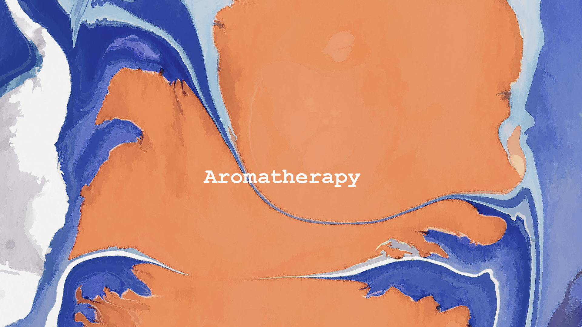
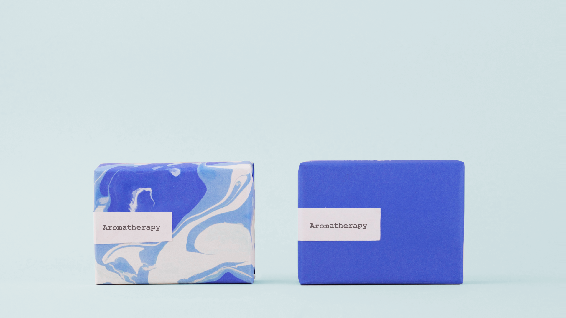
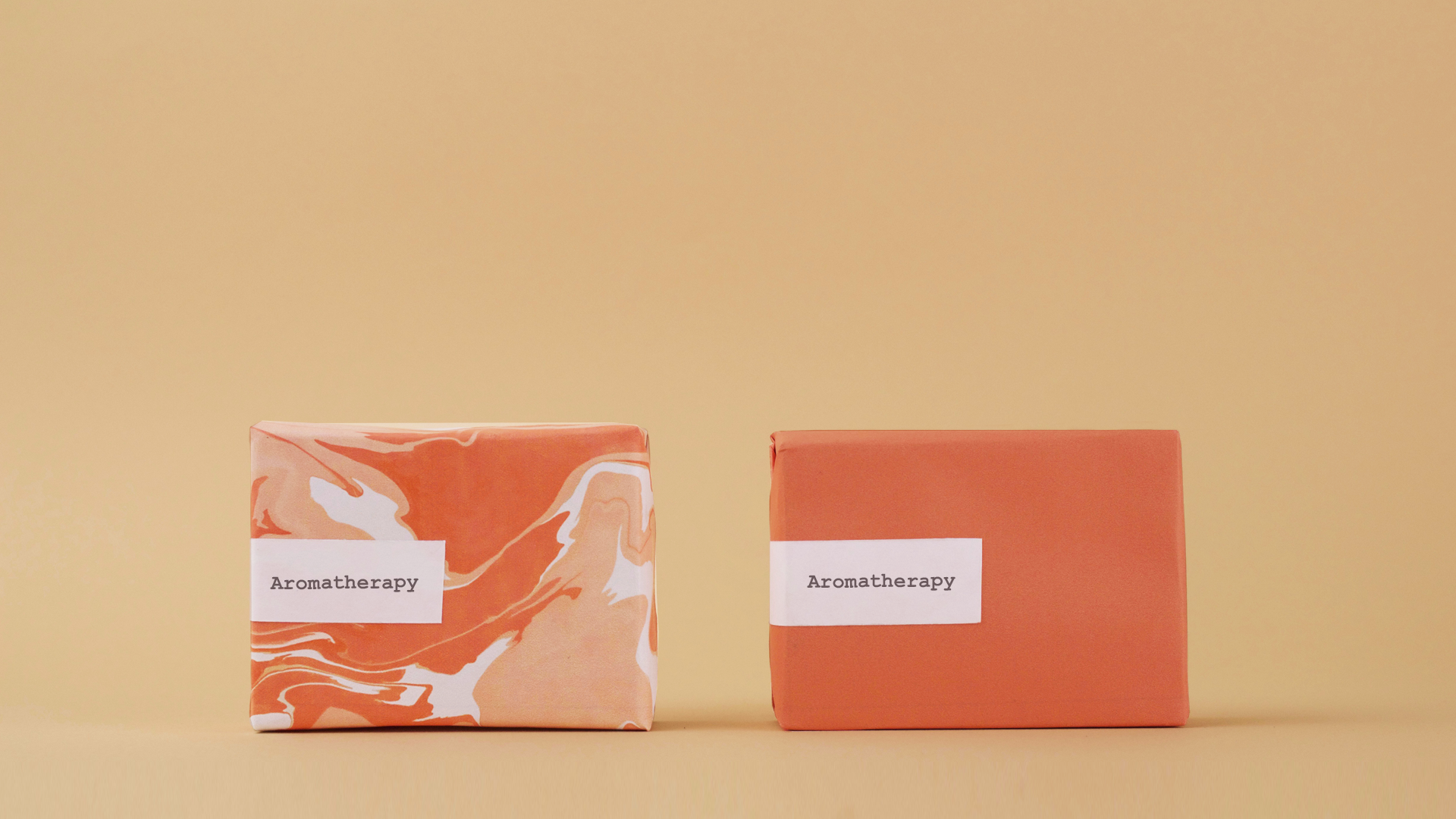
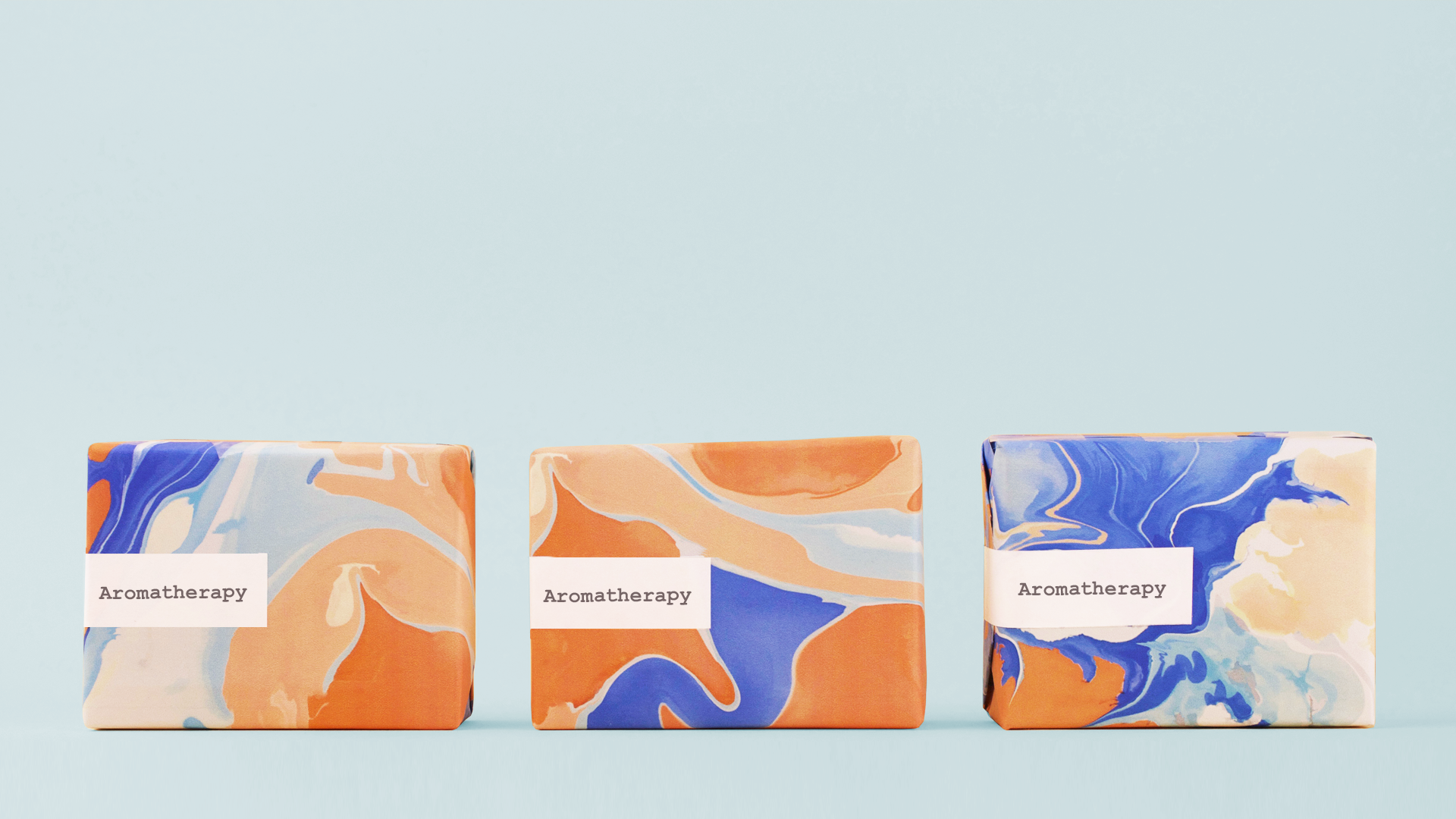
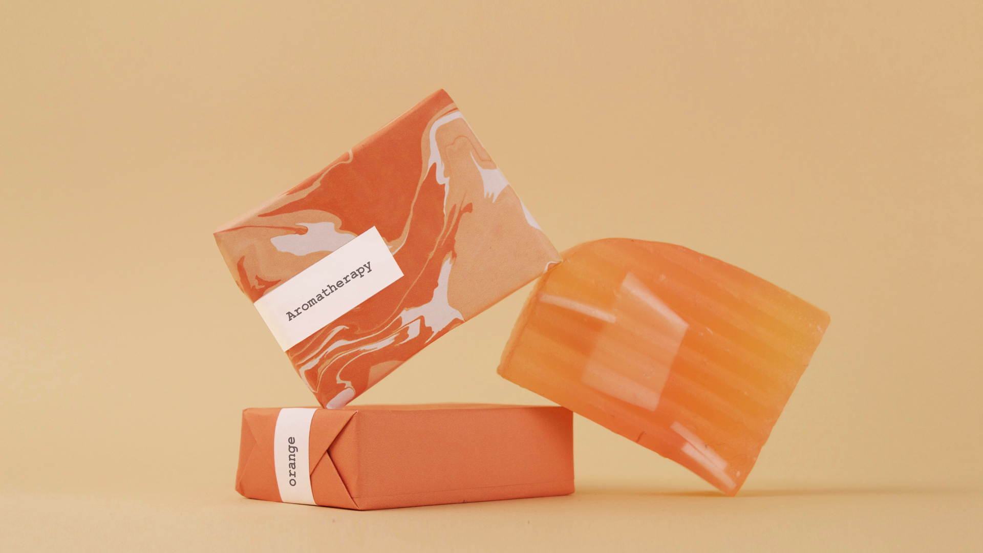
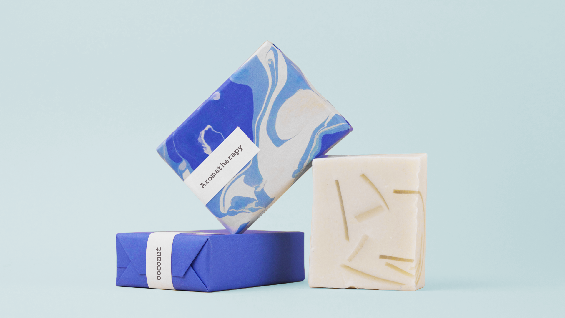
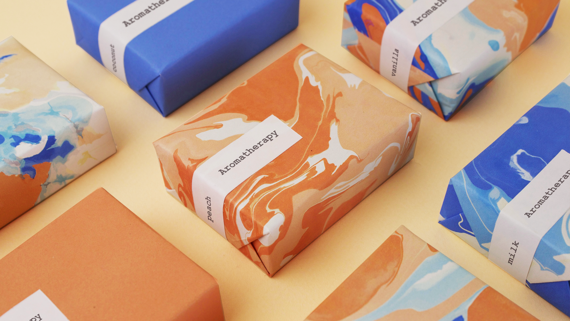
Aromatherapy is body care brand that is know for its handmade natural soaps infused with essential oils. Aromatherapy reached out to Tint Design to develop a brand identity that is inspired by its iconic collection of natural soaps. We created a concept the revolves around the idea of water, freshness and bath time. The selected colors were blue as it’s associated with water, white for lather and orange for freshness. For the packaging, we focused on creating a variety of interesting water swirls compositions and added a simple sticker with the brand logo to highlight the handmade side of the brand and craftsmanship.
COUNTRY
Toronto, Canada
Services
Brand Identity/ Packagin Design