CLIENT
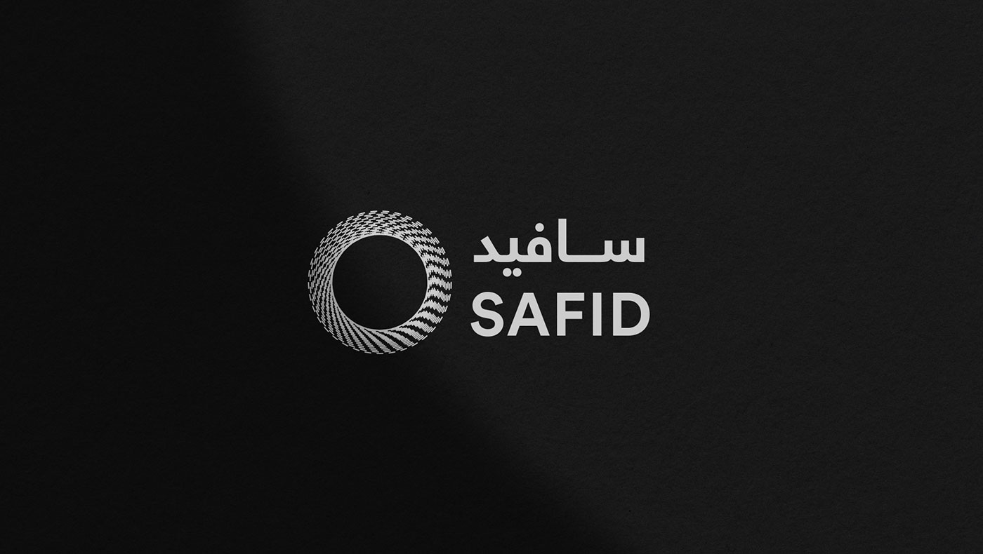
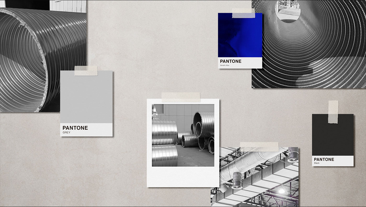
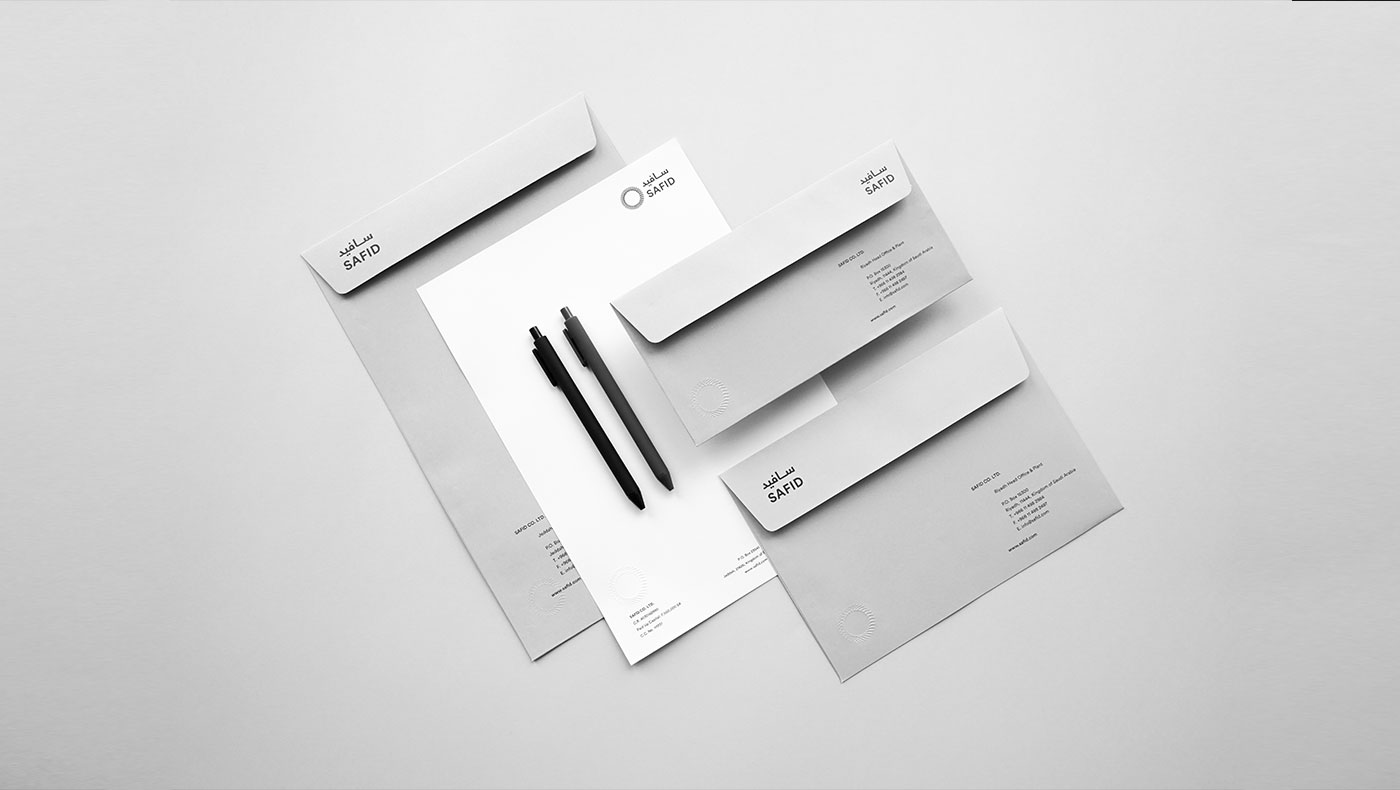
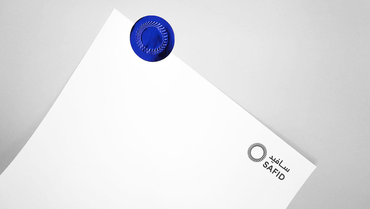
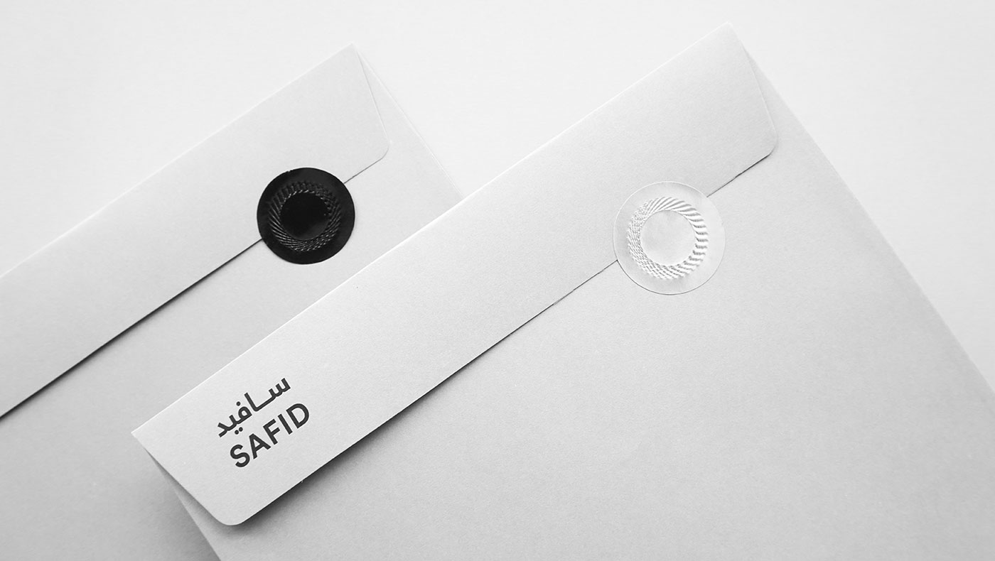
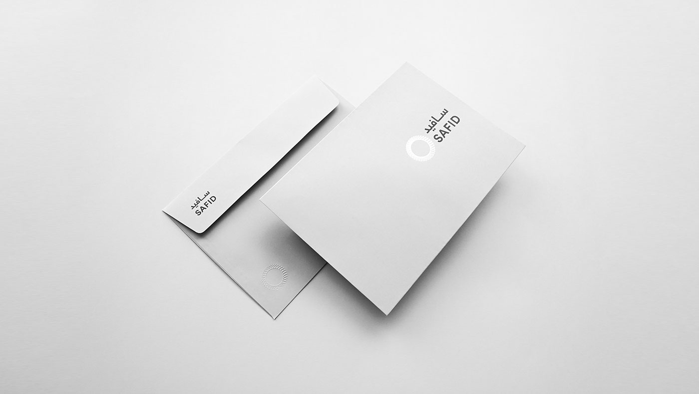
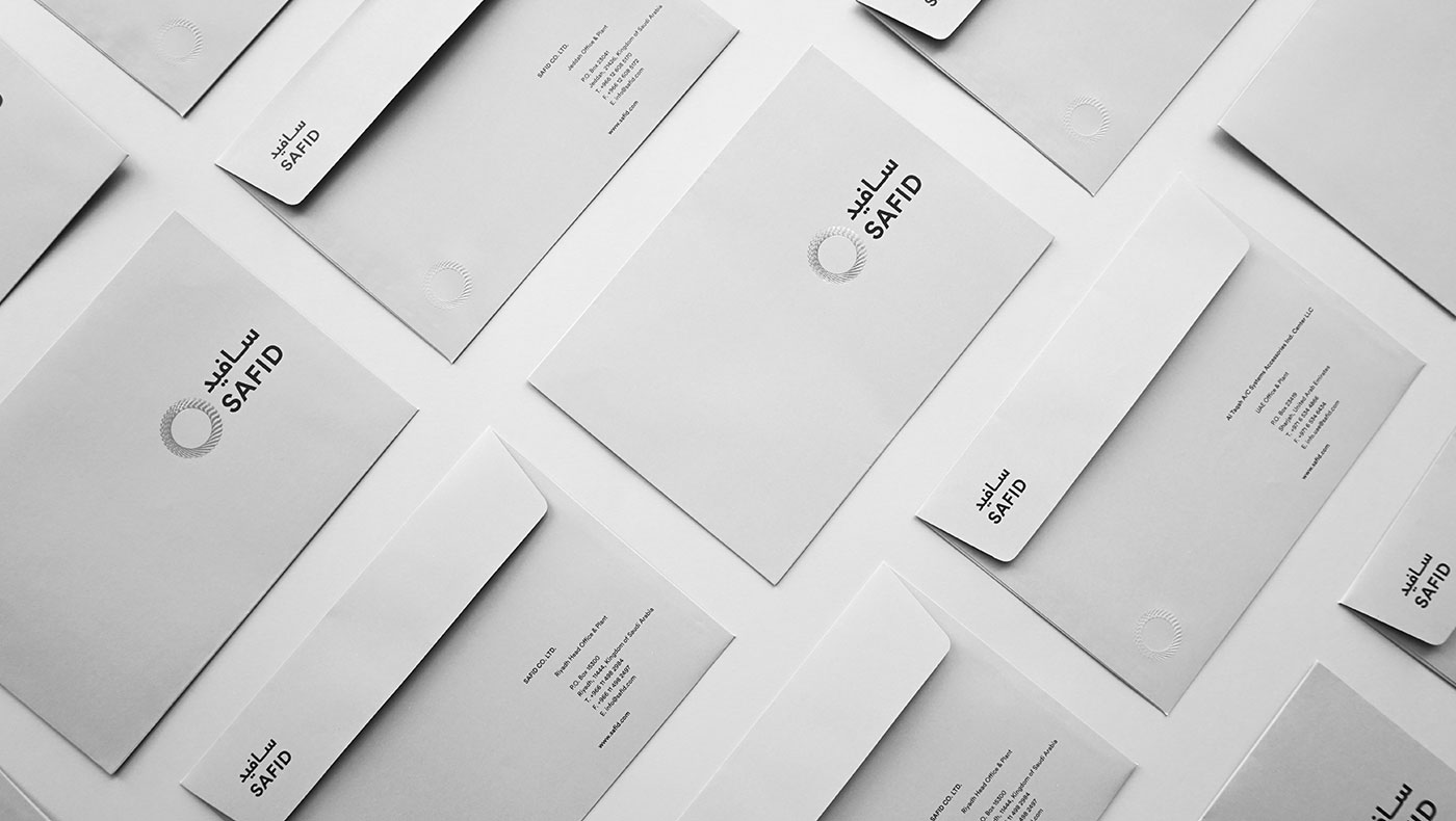
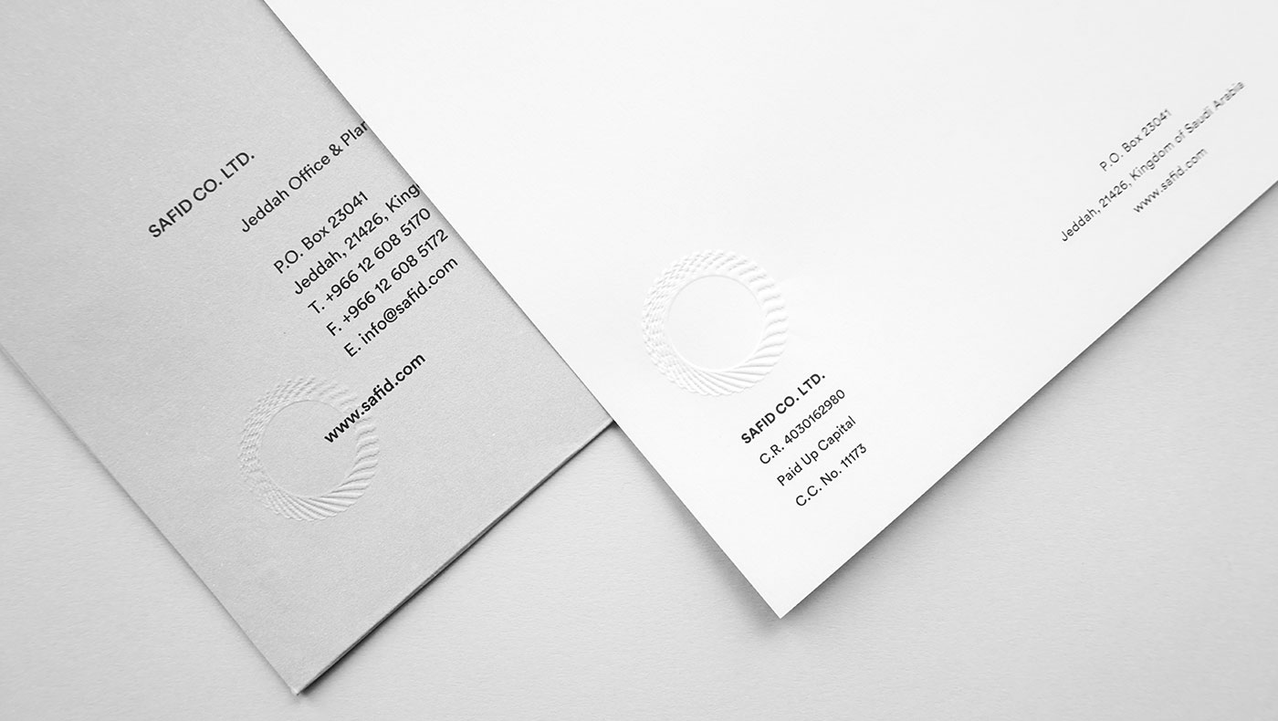
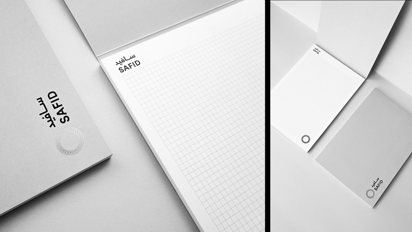
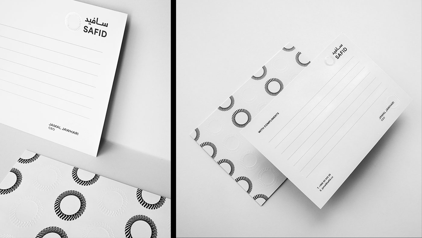
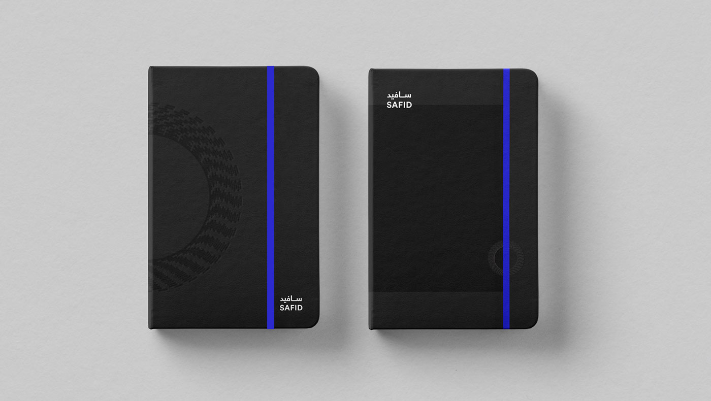
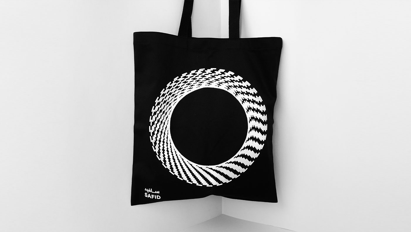
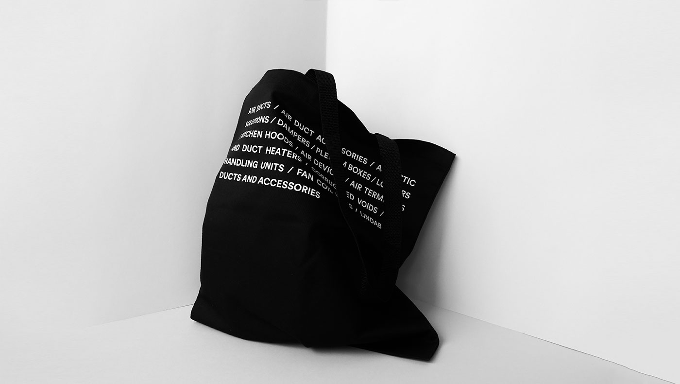
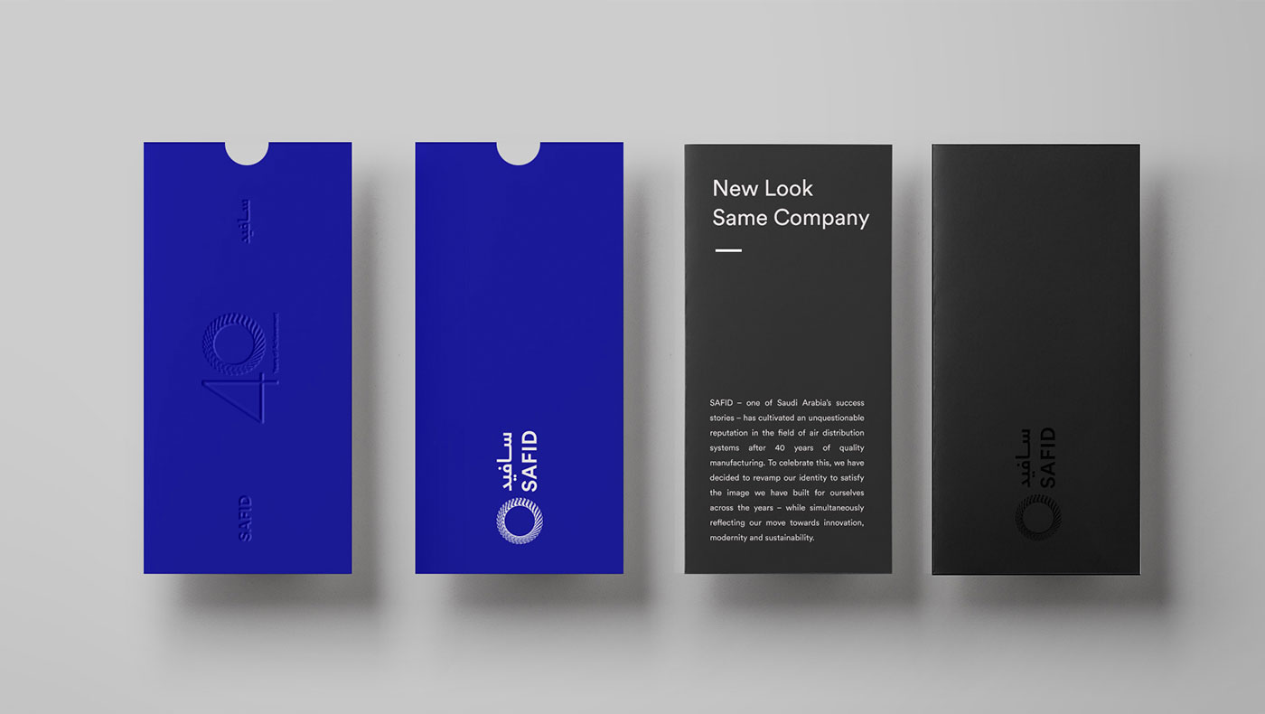
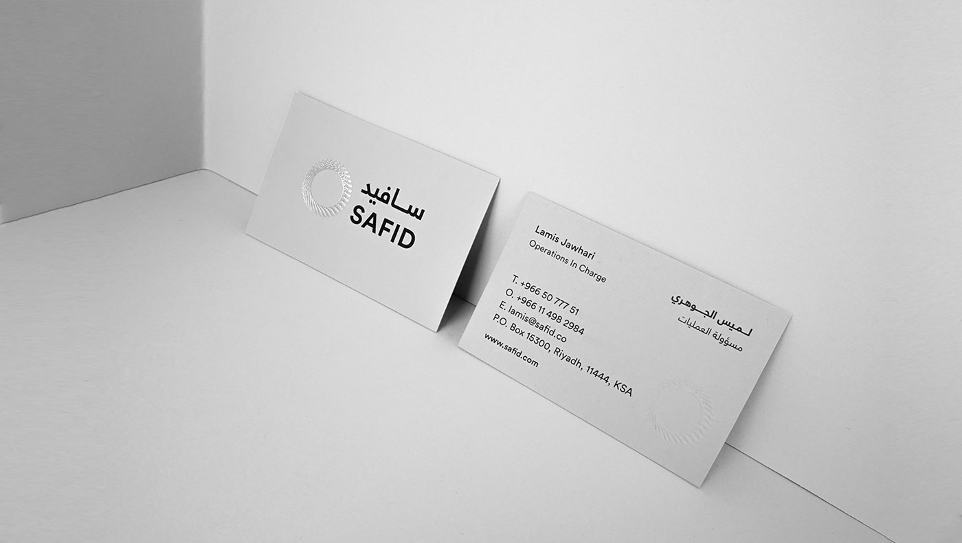
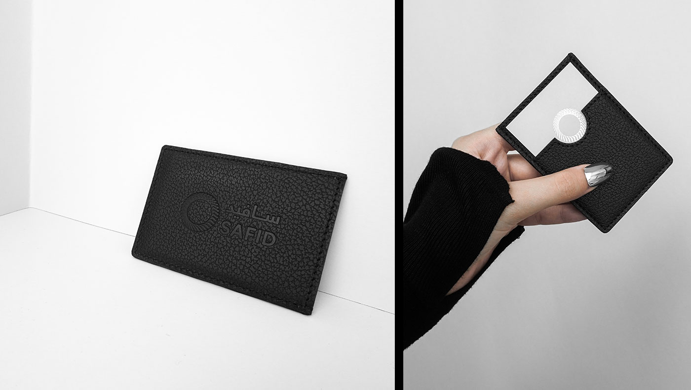
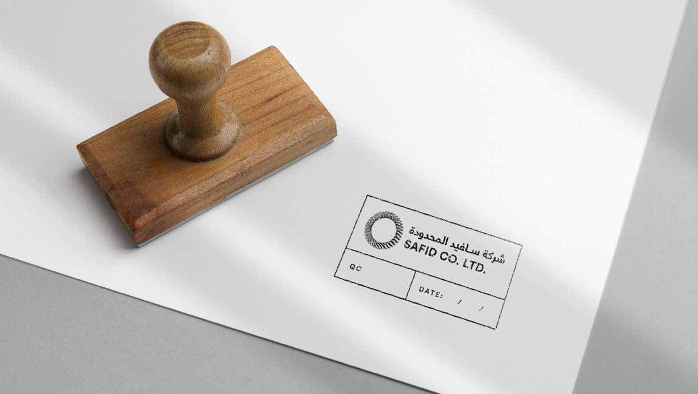
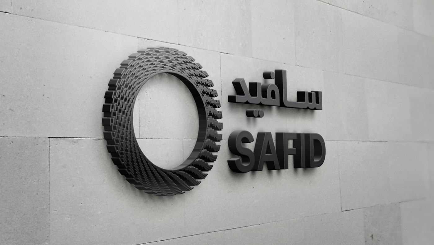
SAFID – one of Saudi Arabia’s success stories founded in 1979 – has cultivated an unquestionable reputation in the field of air distribution systems after 40 years of quality manufacturing. As a celebration of their 40th anniversary, the client wanted to develop a new brand identity that preserves both SAFID past and legacy while adapting the new modern era. SAFID’s new logo was inspired by one of its main products; air duct, which resulted in the creation of circular symbol that gives the illusion of air movement and highlights the eco-friendly aspect of the company. We chose black, white and grey as primary colors to preserve the company’s formal and classic identity, and added metallic blue as a secondary color to symbolize the new modern era of the brand while linking it to the representation of cold air.
COUNTRY
Saudi Arabia / UAE /
Qatar / Kuwait
SERVICES
Brand Identity / Marketing Materials /
Products Catalogues / Social Media /
Promo Items / Website Design /
Website Development